Northern Scoop
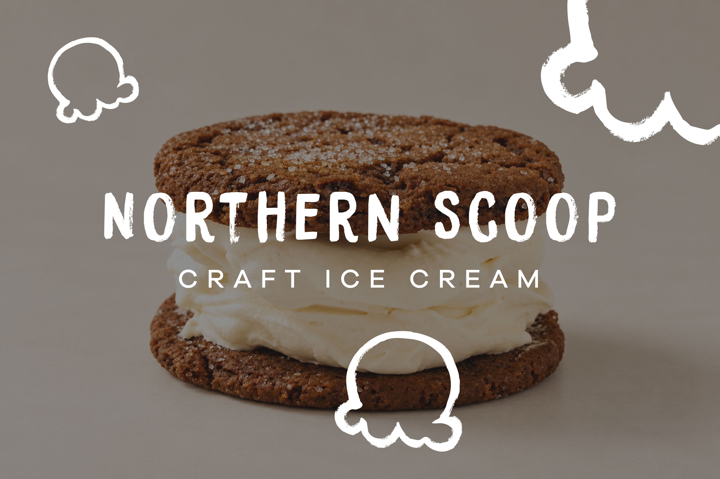
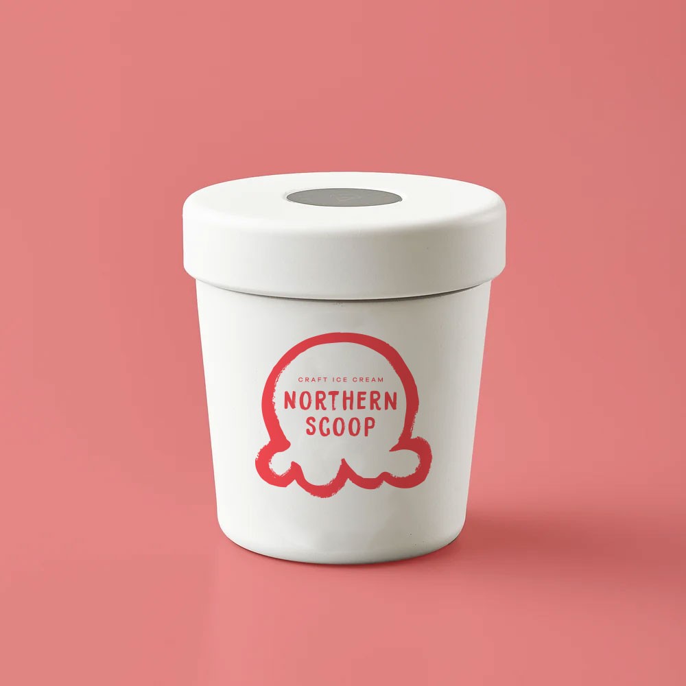
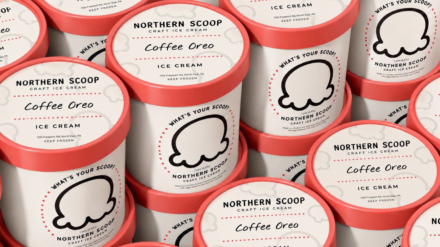
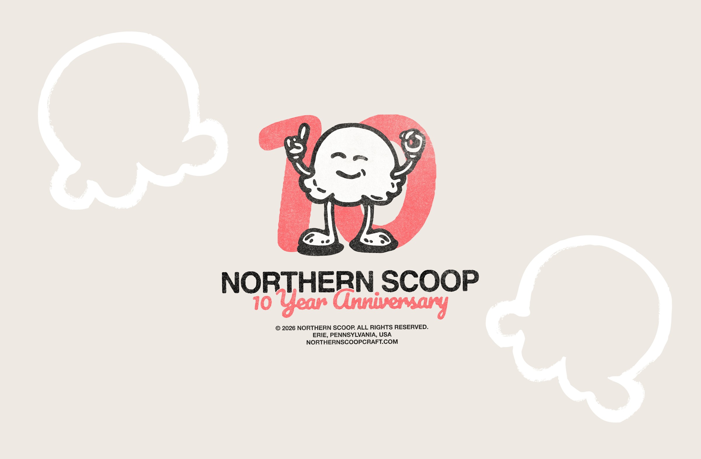
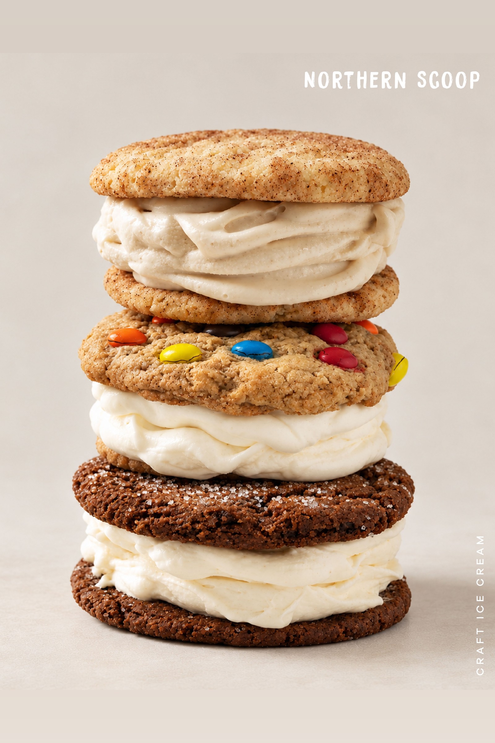
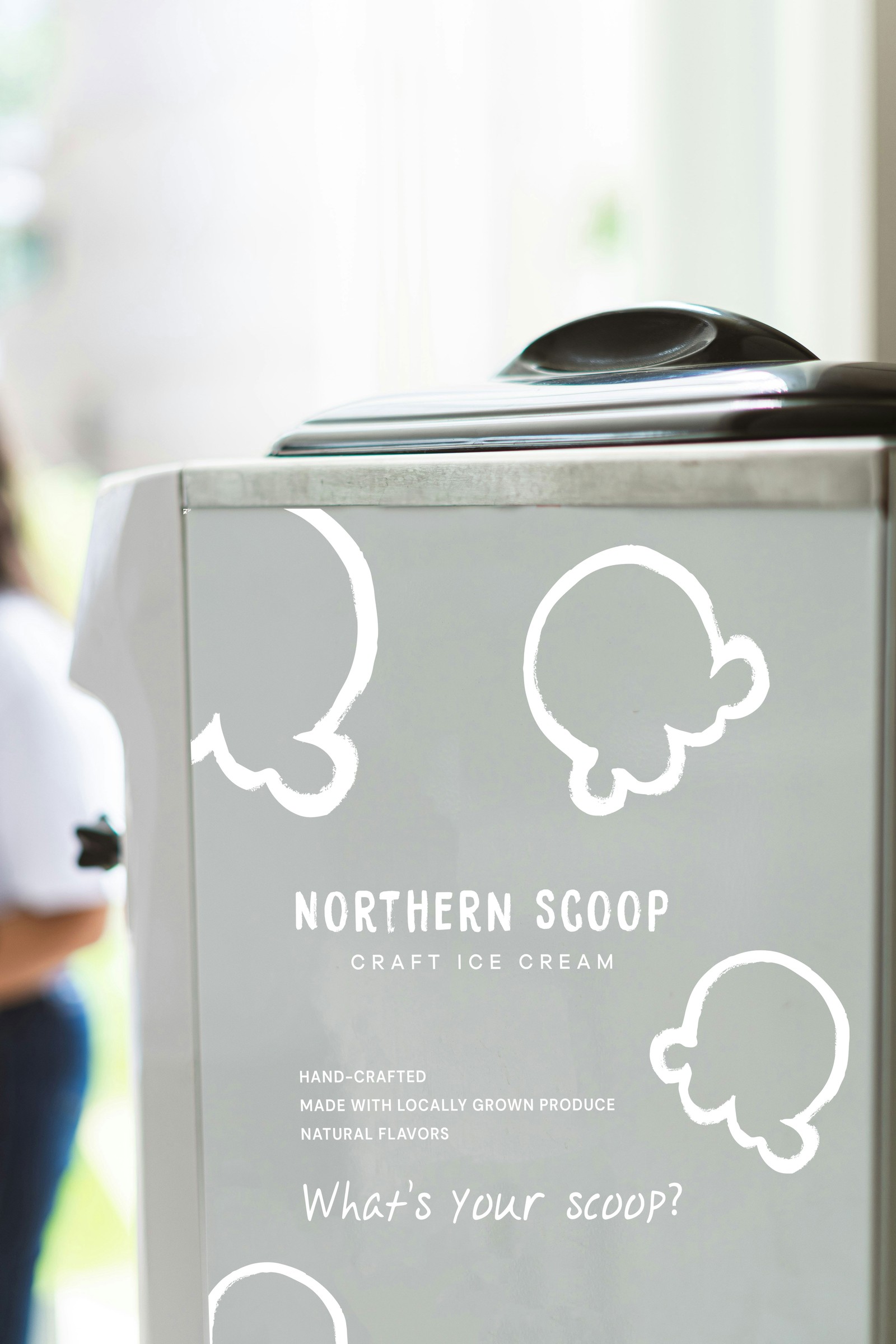
A hand-drawn identity for a small-batch ice cream maker, built around a single scoop mark and carried across pints, apparel, and retail signage.
Services
Brand Identity, Packaging Design, Apparel
Year
2021
Client
Northern Scoop
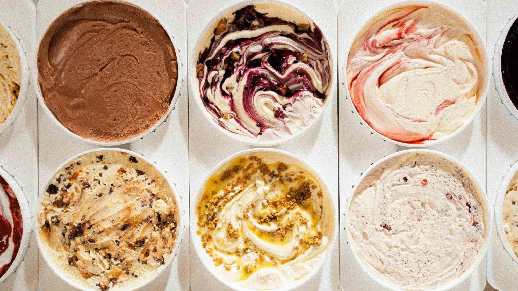
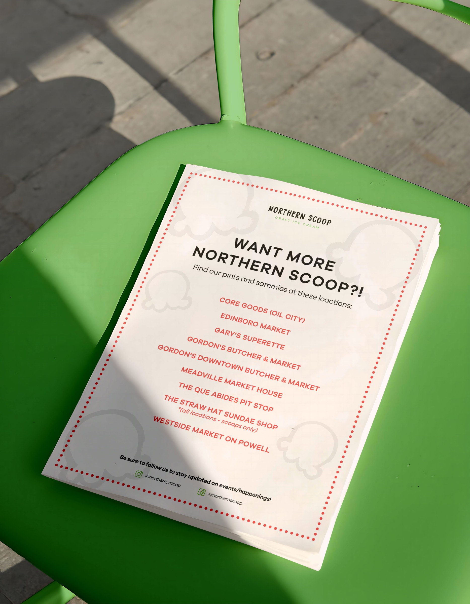
Northern Scoop needed a mark simple enough to work everywhere — on a pint lid, a cart decal, a t-shirt back — and legible even reduced to a single color. We built the identity around one hand-brushed scoop shape, paired with a rough marker wordmark that reads handmade rather than corporate. The palette holds to three colors: a warm coral, black, and a light green, so any application prints cleanly in one or two colors. The system runs across pint packaging, seasonal apparel, and the retail cart the brand shows up in at markets and local shops.