Dezo
A brand identity and can packaging system for the world's first canned superfruit cocktail, spiked with gluten-free vodka across three fruit flavors.
Services
Brand Identity, Packaging Design, Web Design
Year
2019
Client
Dezo
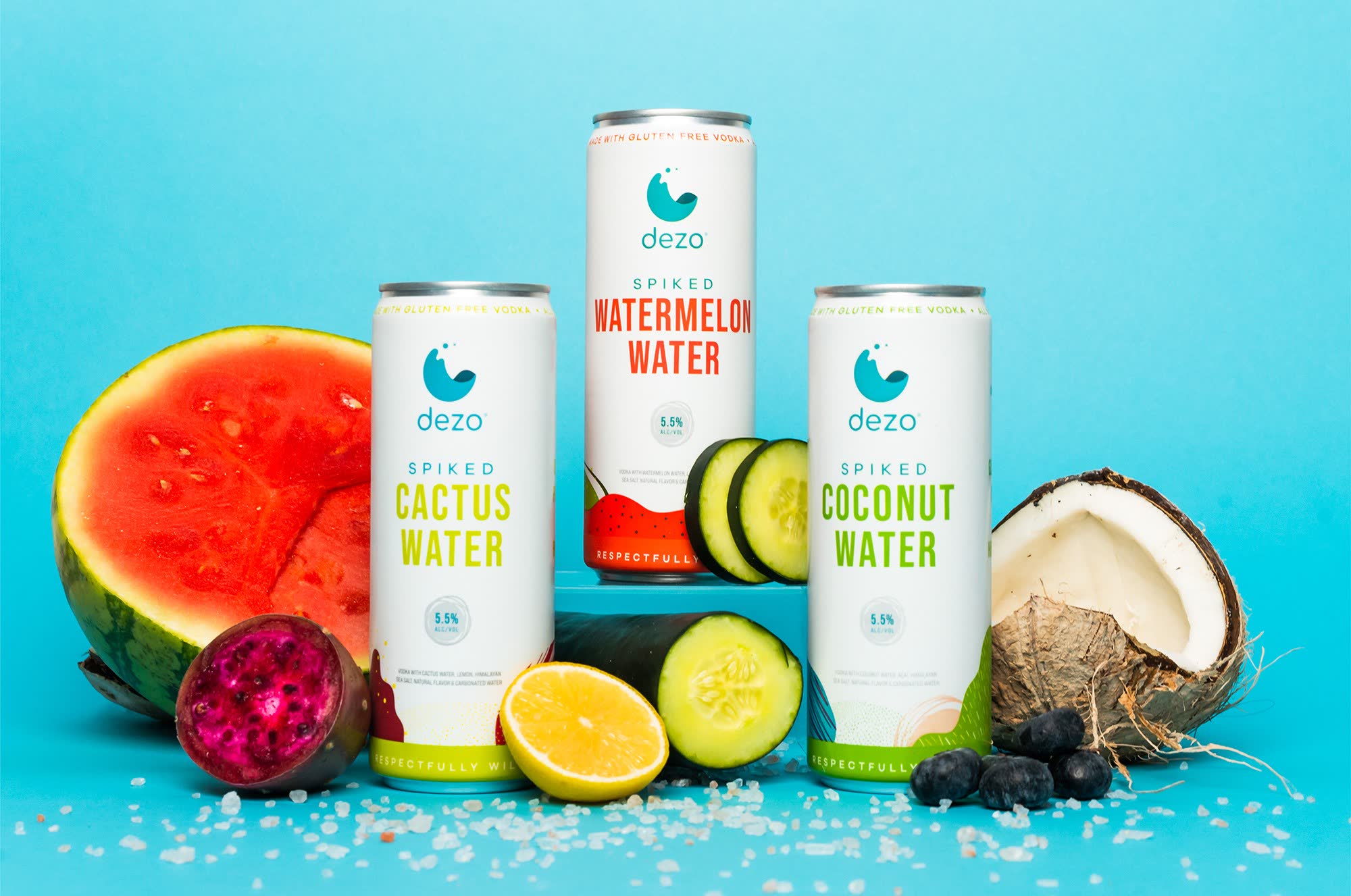
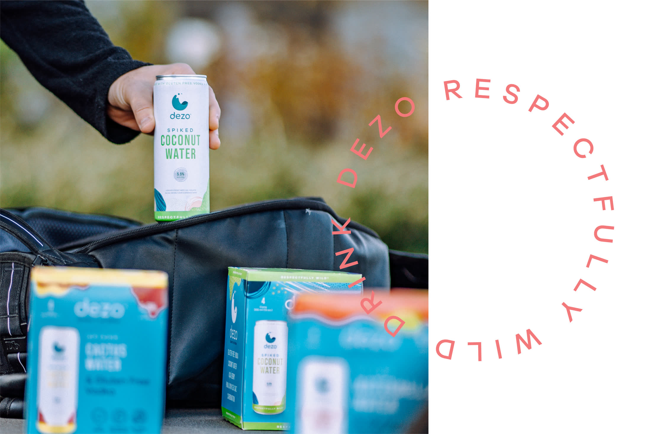
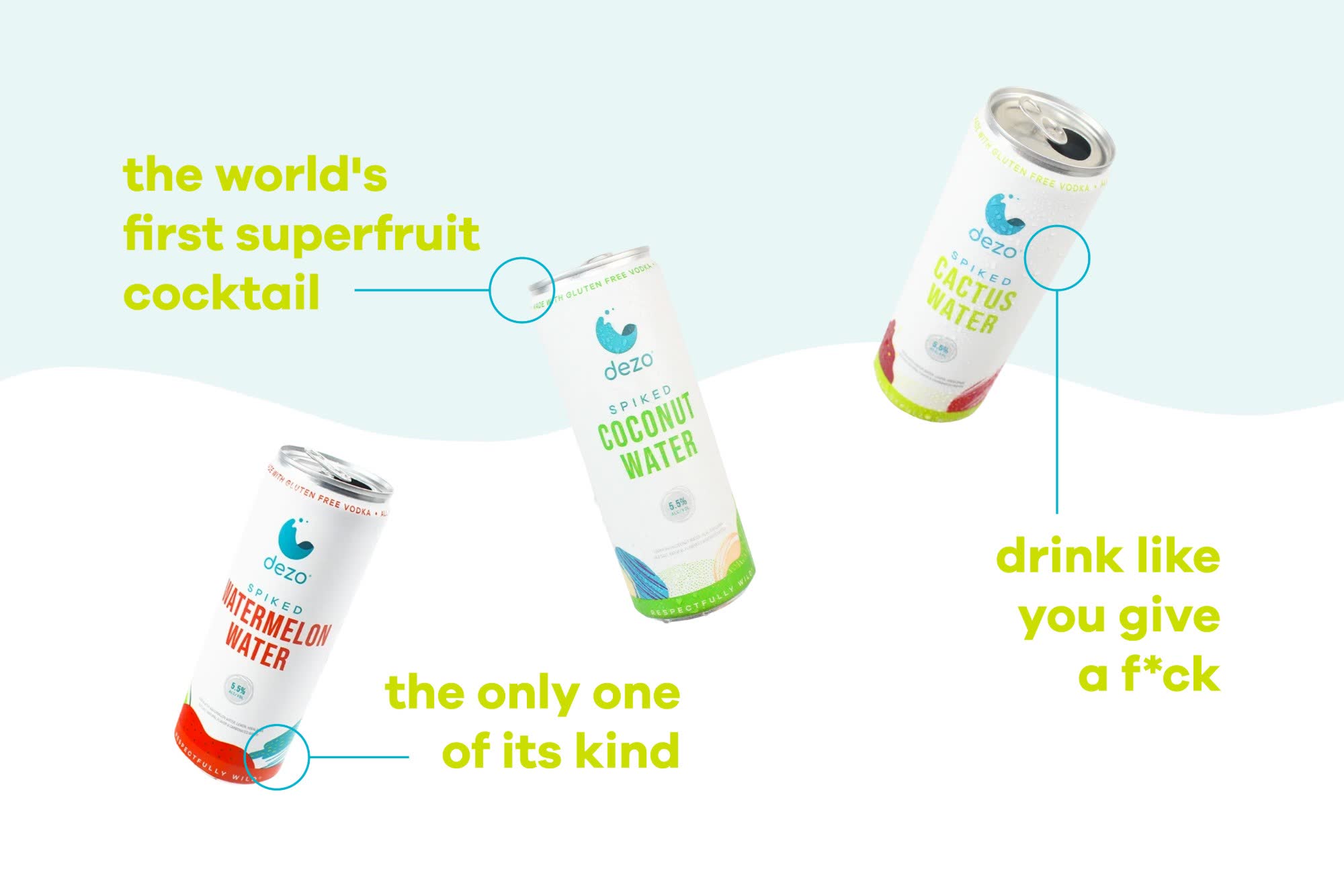
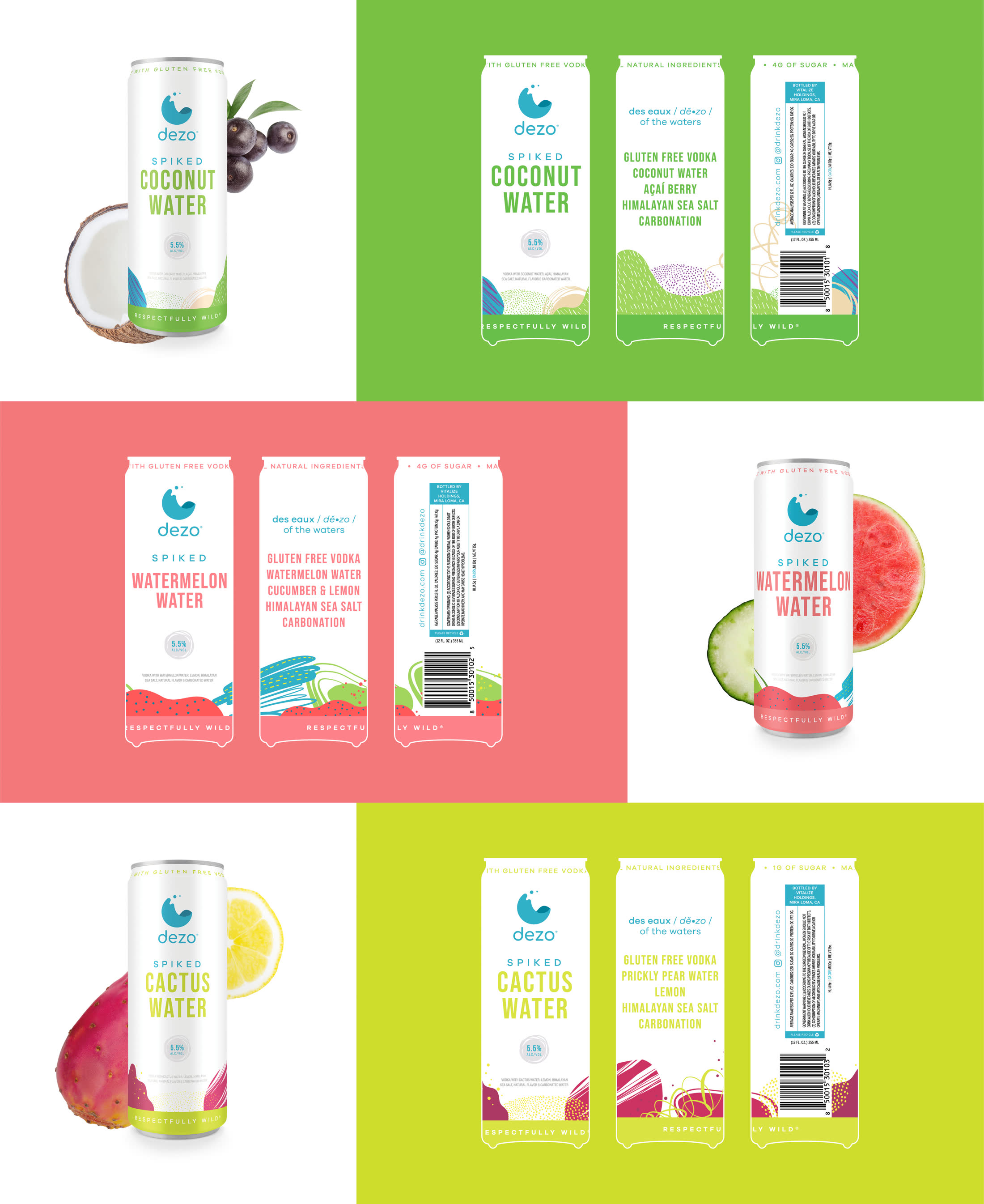
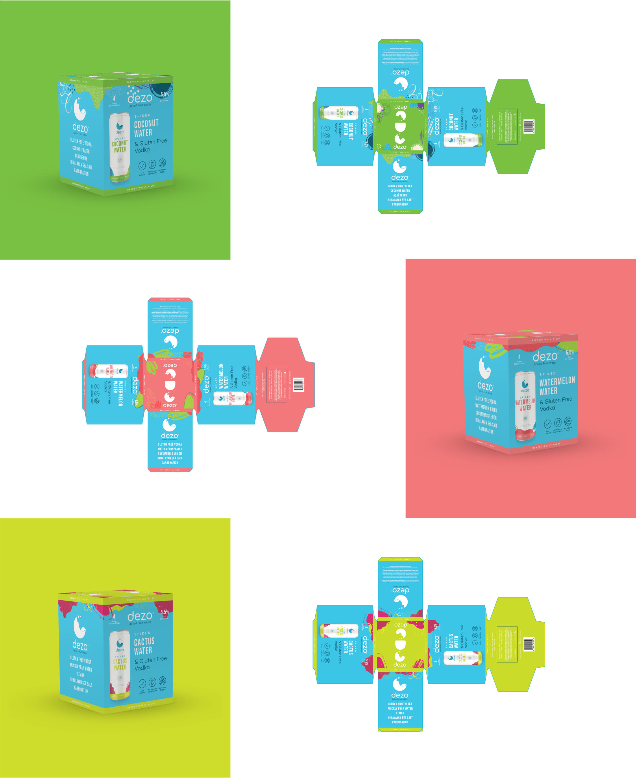
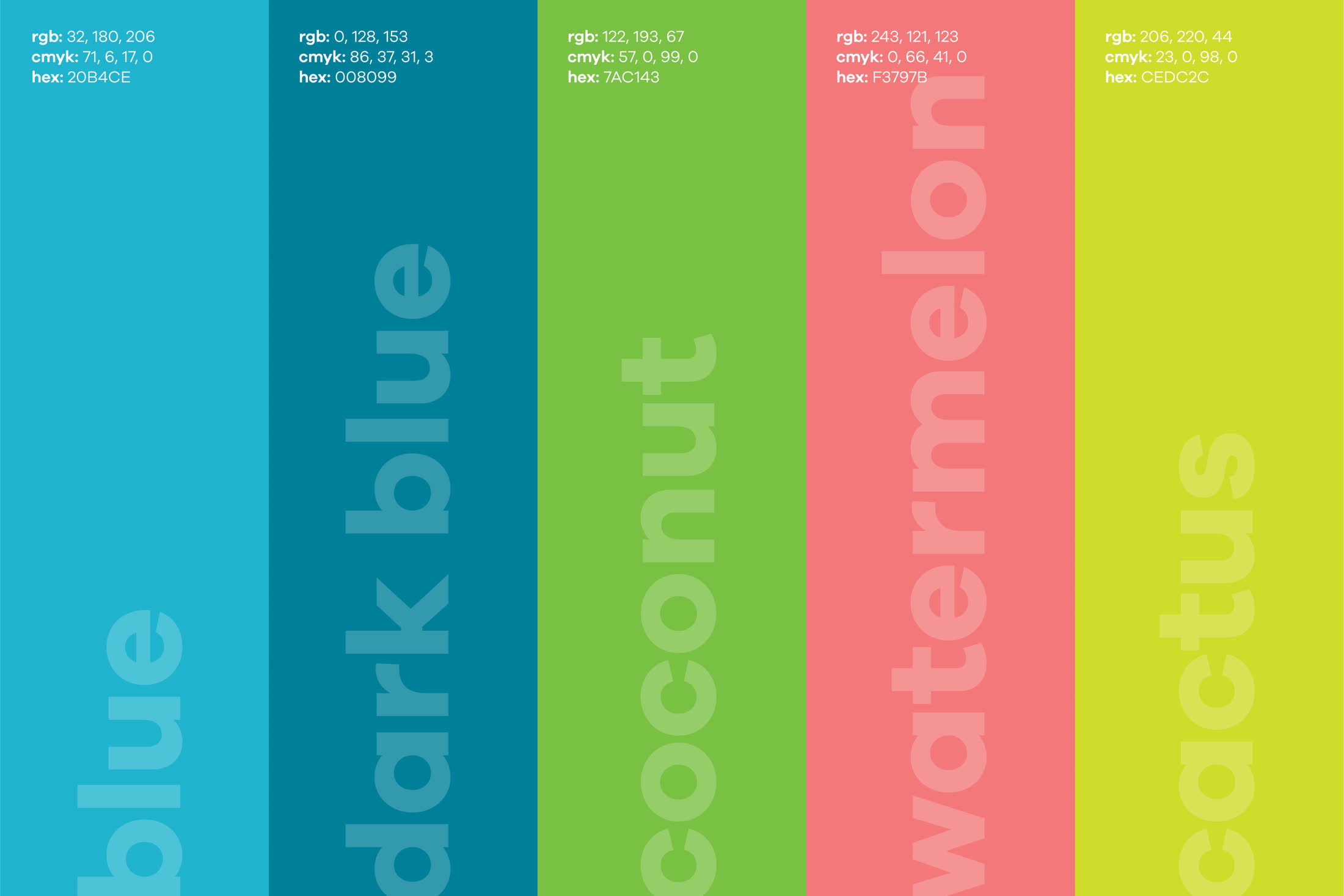
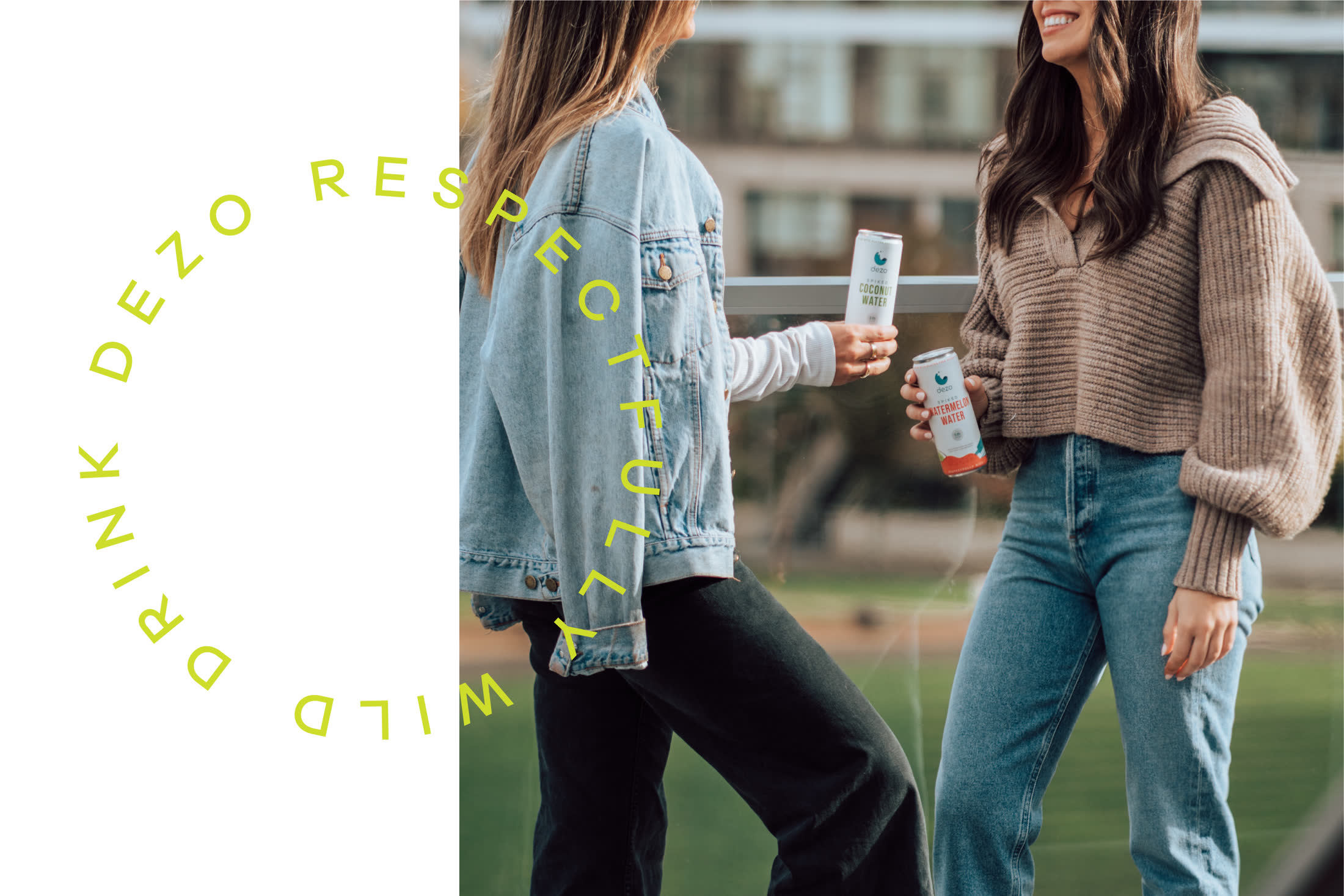
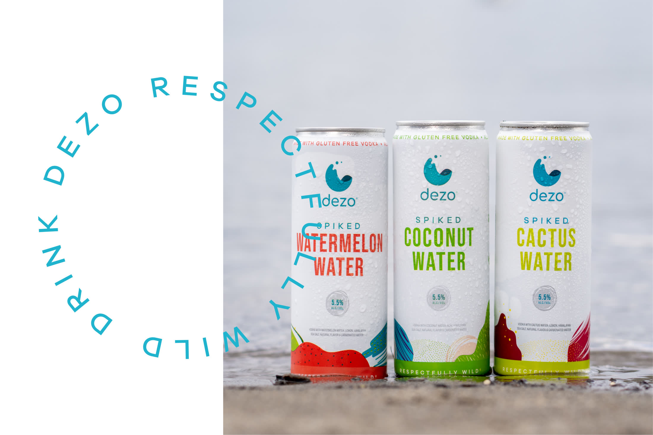
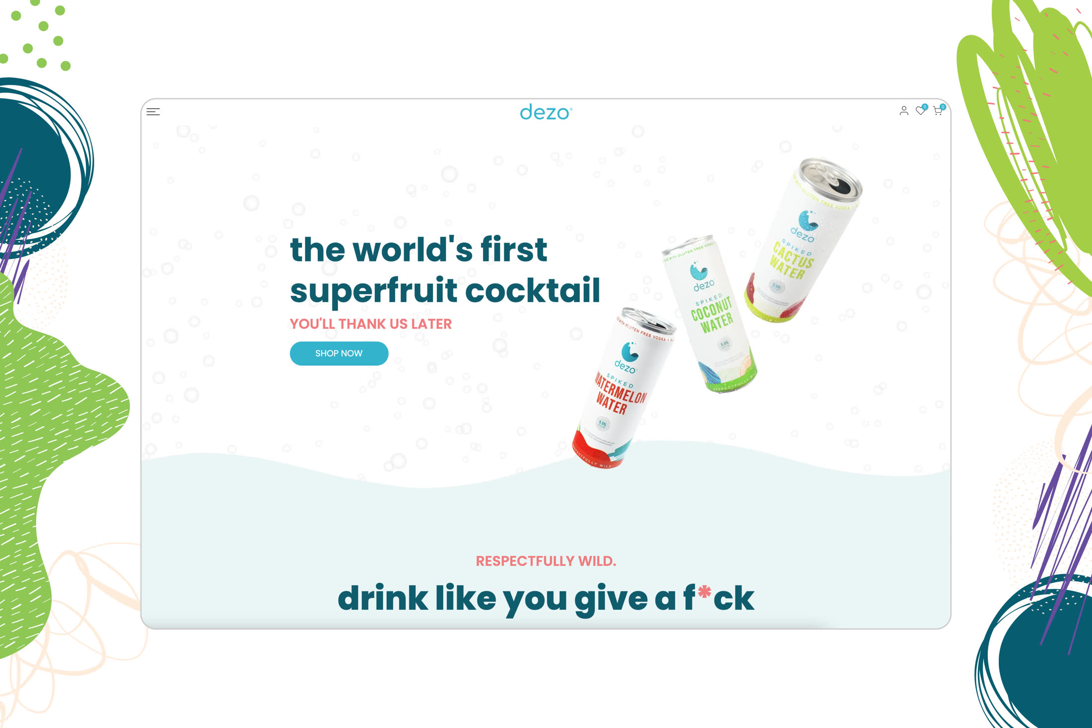
Dezo launched a new kind of canned cocktail: real fruit water and gluten-free vodka, without the sugar of a mixed drink or the bloat of beer. We built the identity around a simple water-droplet mark, paired with a wordmark cut to match its curve, and a name drawn from the French des eaux — 'of the waters.' Three launch flavors, Coconut, Watermelon, and Cactus, each carry their own color and a loose, fruit-drawn pattern on the can, while the label copy stays plain: what's inside, what's not, and the vodka's ABV. The system carries across cans, four-packs, cartons, and the launch site, and holds up the same whether it's shot on a plain background or in someone's hand.